Friendly Reminder: Main points are bolded for your convenience and user experience 😊👍🏼
Duration: 3 months
My Contributions: UX Research, Wireframing, Low-Fidelity Prototyping, High-Fidelity Prototyping, Data Analysis
Toolbox: Figma, Miro, Adobe Illustrator, Canva, G Suite
Description
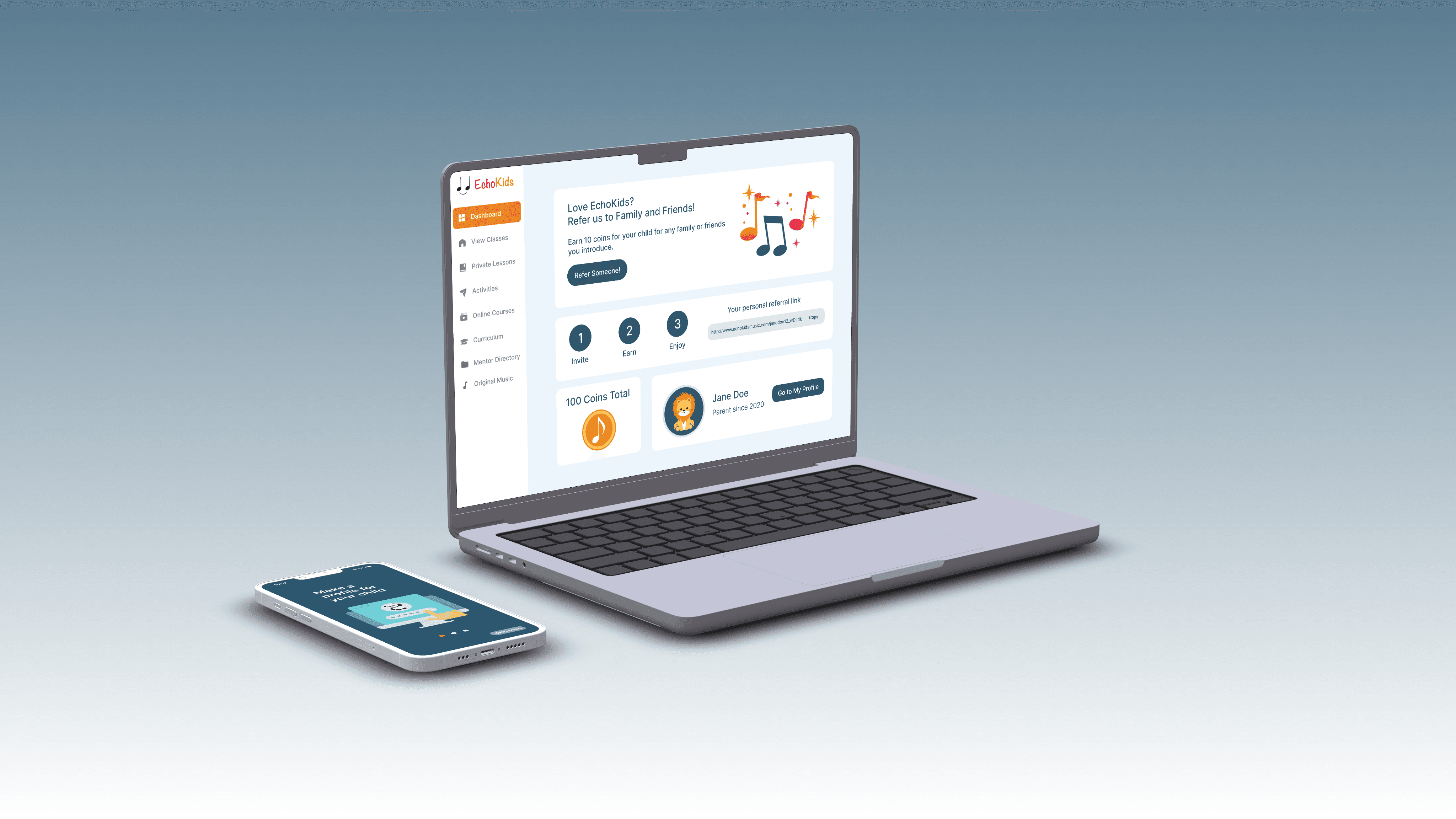
Echokids is a innovative platform aimed at providing young music enthusiasts with access to professional mentors with their guardian’s guidance. My role as an intern involved revamping the company's web application, which was in need of a modern update, and beginning the development of a mobile app to expand the reach of the platform via data-driven decisions. The redesign of the web app focused on improving the user experience for both mentors and parents, making it easier for them to connect and communicate about their shared love for music.
The Echokids web application was outdated and provided a poor user experience for both mentors and parents alike. The design on the platform lacked the necessary updates and modern features needed to enhance the experience for users. This negatively impacted the overall performance of the application and limited its potential for growth and success.
The EchoKids web application was a little off-key and needed to be fine tuned...
The Problem

Time to create a symphony of redesign and a mobile platform - music to everyone’s ears
The Solution
The solution to the problem of an outdated and poorly designed Echokids web application was a comprehensive redesign project. The primary goals of the project were twofold: first, to bring the web application up to date with modern design and user experience standards, and second, to lay the foundation for a new mobile app that would further enhance the experience for both mentors and parents. By modernizing the web application and providing a seamless mobile experience, the Echokids platform would be better positioned to meet the needs of its users and support its growth and success in the future.
Designing a Solution: Data-Driven Decisions
Designing a Solution: User Challenges
Google Analytics
Pain Points
My role redesigning the web application began in November and spanned 3 months until the end of January. At the start of the project, the website presented the following metrics:
The referral page initially led to a pop-up, however due to bugs, a separate page was created to improve the user experience and eliminate the inconvenience caused by the pop-up.
The dead-end inbox page was a significant pain point for users, preventing them from effectively communicating with mentors and support.
The founder's vision for the platform included a student dashboard, which required the ability for users to switch profiles and link multiple children to be inclusive of all types of families.
The original parent dashboard was cluttered with irrelevant features, such as mentor reviews and featured games, making it difficult for users to navigate and access necessary information.
To fully realize the founder's vision, the redesign project included the creation of a student dashboard
The Echokids platform lacked a mobile solution, leaving a gap in the user experience for both mentors and parents.
These metrics provided a benchmark for measuring the progress and impact of the redesign project. The high bounce rate and short session duration indicated that there was a clear need for improvement in the user experience of the web application. By tracking these metrics before and after the redesign, it was possible to see the tangible results of the project and gauge its impact on the users. The baseline also provided a way to continuously monitor the performance of the website and identify areas for further improvement. With this information, it was possible to make informed decisions about the future of the Echokids platform and ensure its success in connecting parents with music mentors for their kids.
The high bounce rate and short session duration of the Echokids web application, as recorded in the Google Analytics data, indicated that there were pain points in the user experience. As part of the redesign project, I was tasked with identifying and addressing these pain points to improve the overall user experience. This involved evaluating the existing pages for bug and user flow issues and either redesigning them or creating new pages to address any gaps.
November 2022 Statistics
1.59%
Bounce Rate
222
New Users
03:27 minutes
Average Session Duration
User flow issues when navigating to referrals
Inbox page lead to a dead end for users
The initial parent dashboard had features that were not relevant to users
No existing student dashboard
No existing mobile platform
Users unable to link children or switch profiles
Final Redesign: Before and After
Referrals
Inbox Page
Parent Dashboard - Main
Parent Dashboard - Settings
Before
EchoKids Web Application - Existing Pages
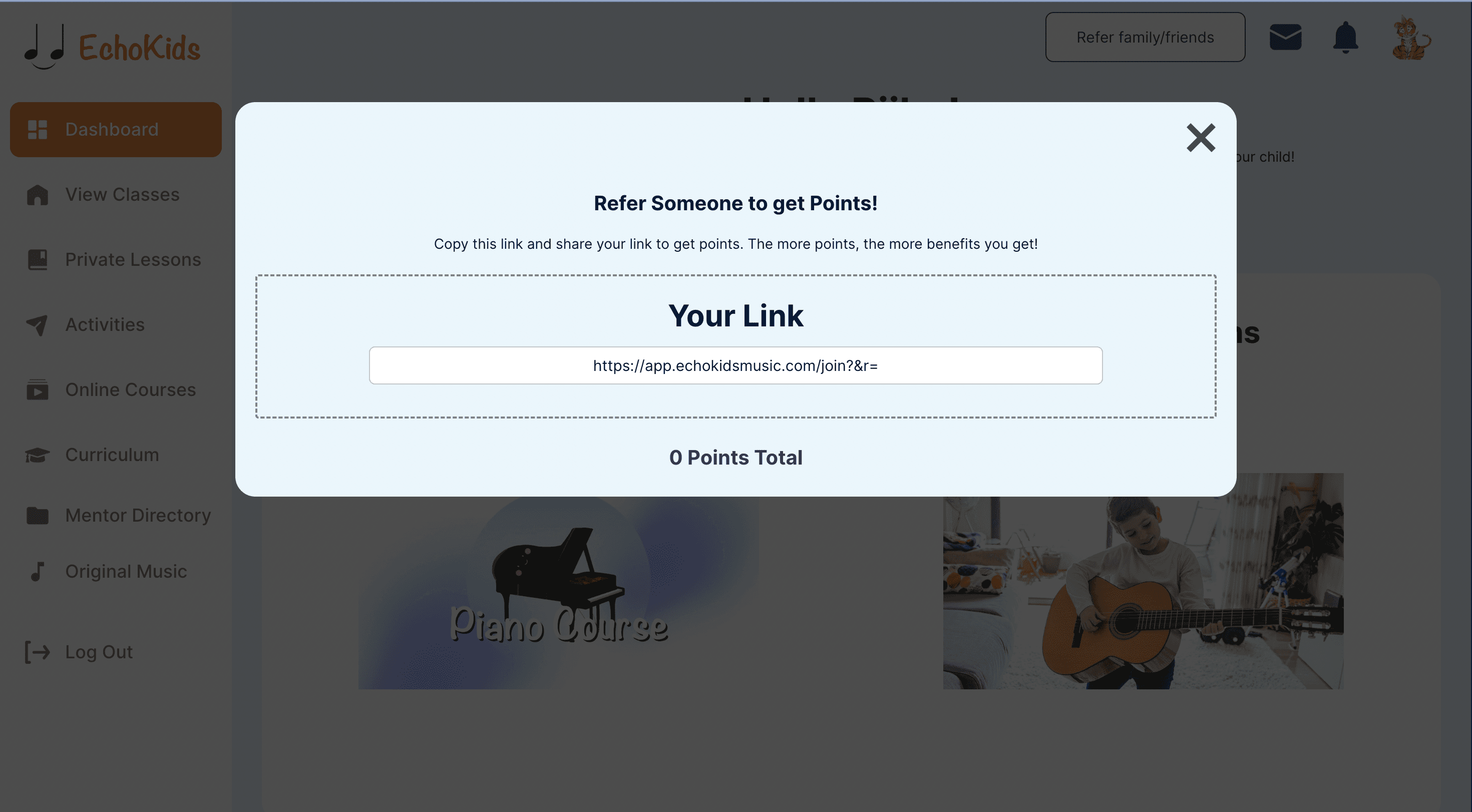
The referral page was merely a pop-up with minimal instructions, causing frustrations for users trying to refer friends.
After
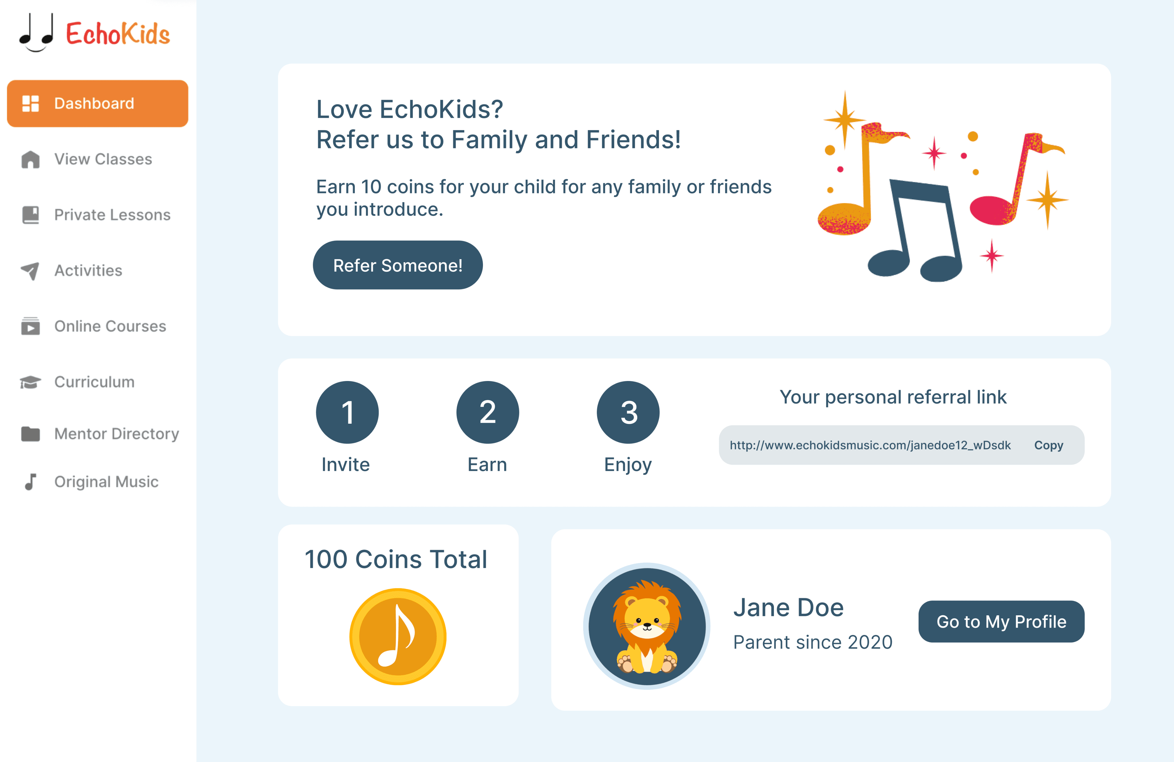
After the redesign, the referral page was given its own dedicated space, complete with clear and concise instructions to ensure a seamless referral experience.
Before
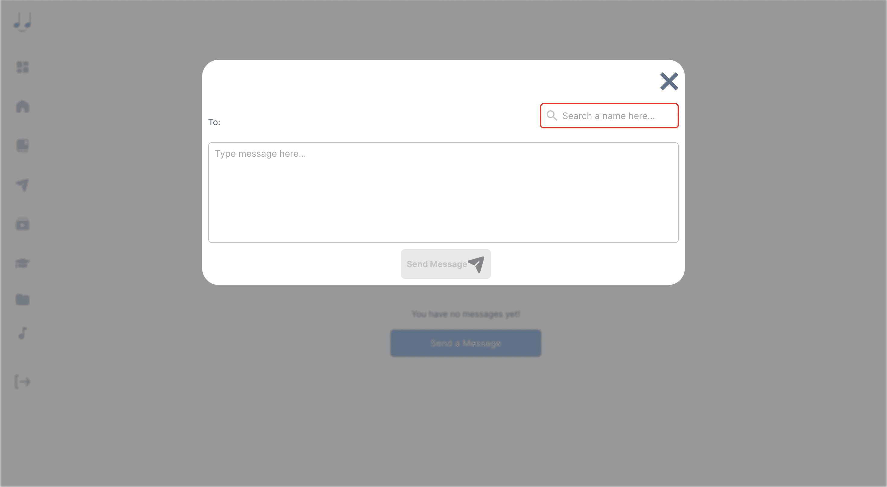
The inbox page was frustrating for users as it led to a dead end and required multiple clicks to access a pop-up with a search function and text box.
After
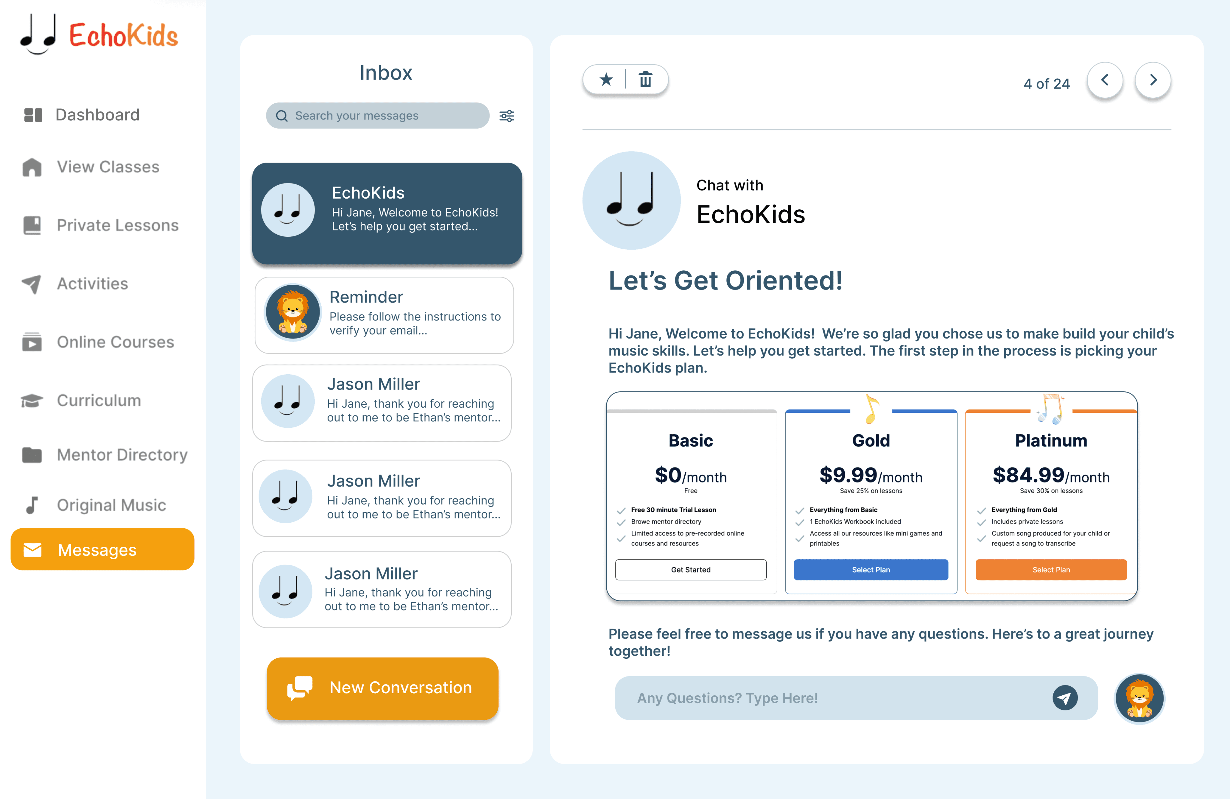
The inbox page received its own dedicated page with intuitive UI, featuring clearly visible buttons and an improved search function.
Before
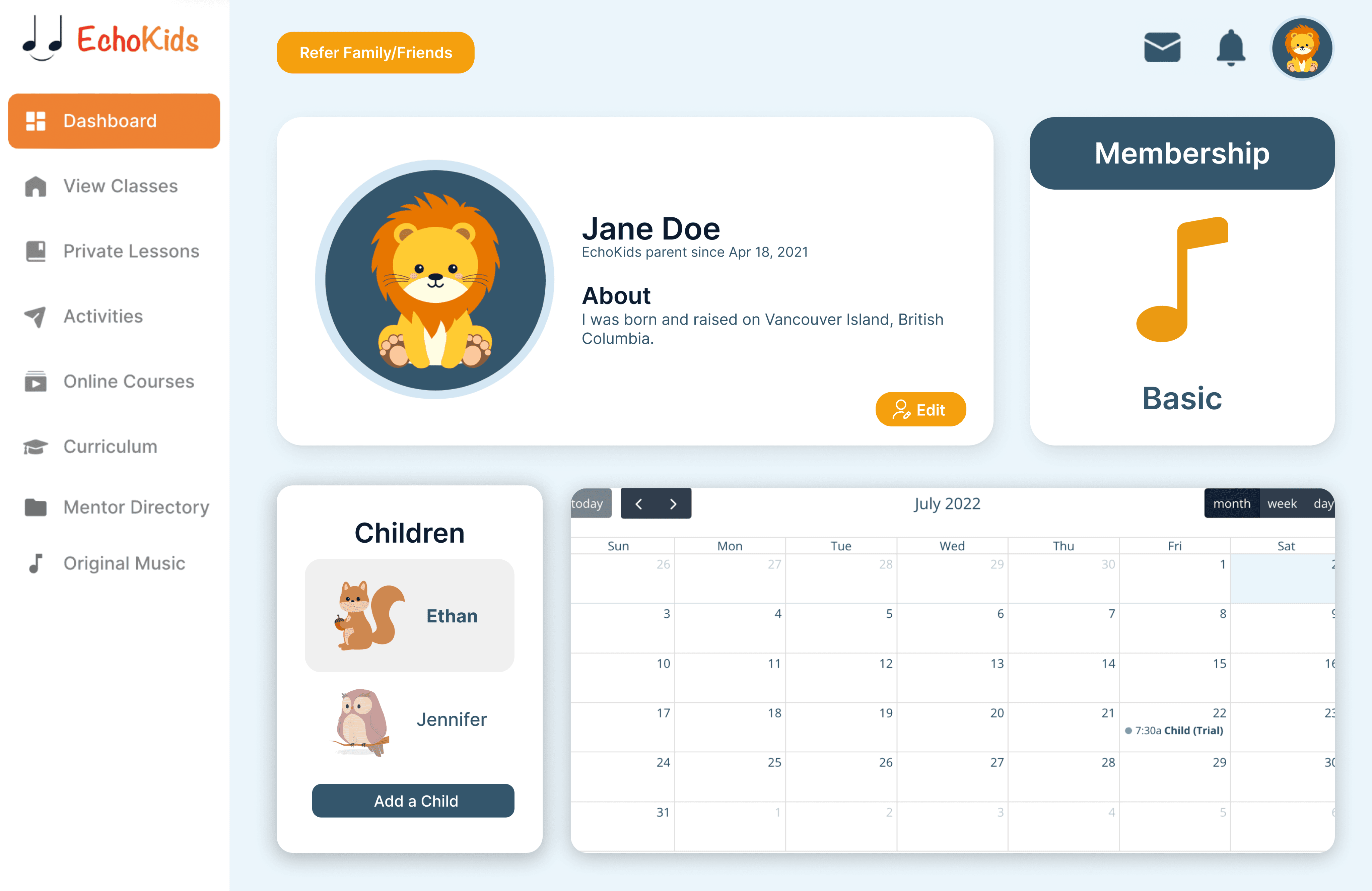
The parent dashboard lacked relevant information such as mentor reviews and featured courses, and did not have any relation to a dashboard.
After
Relevant features were added including the ability to switch between child profiles and a calendar displaying upcoming mentor sessions.
Before
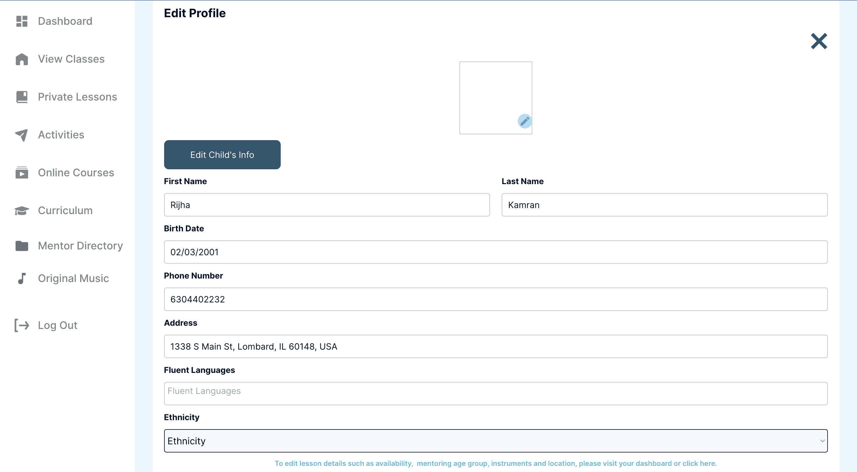
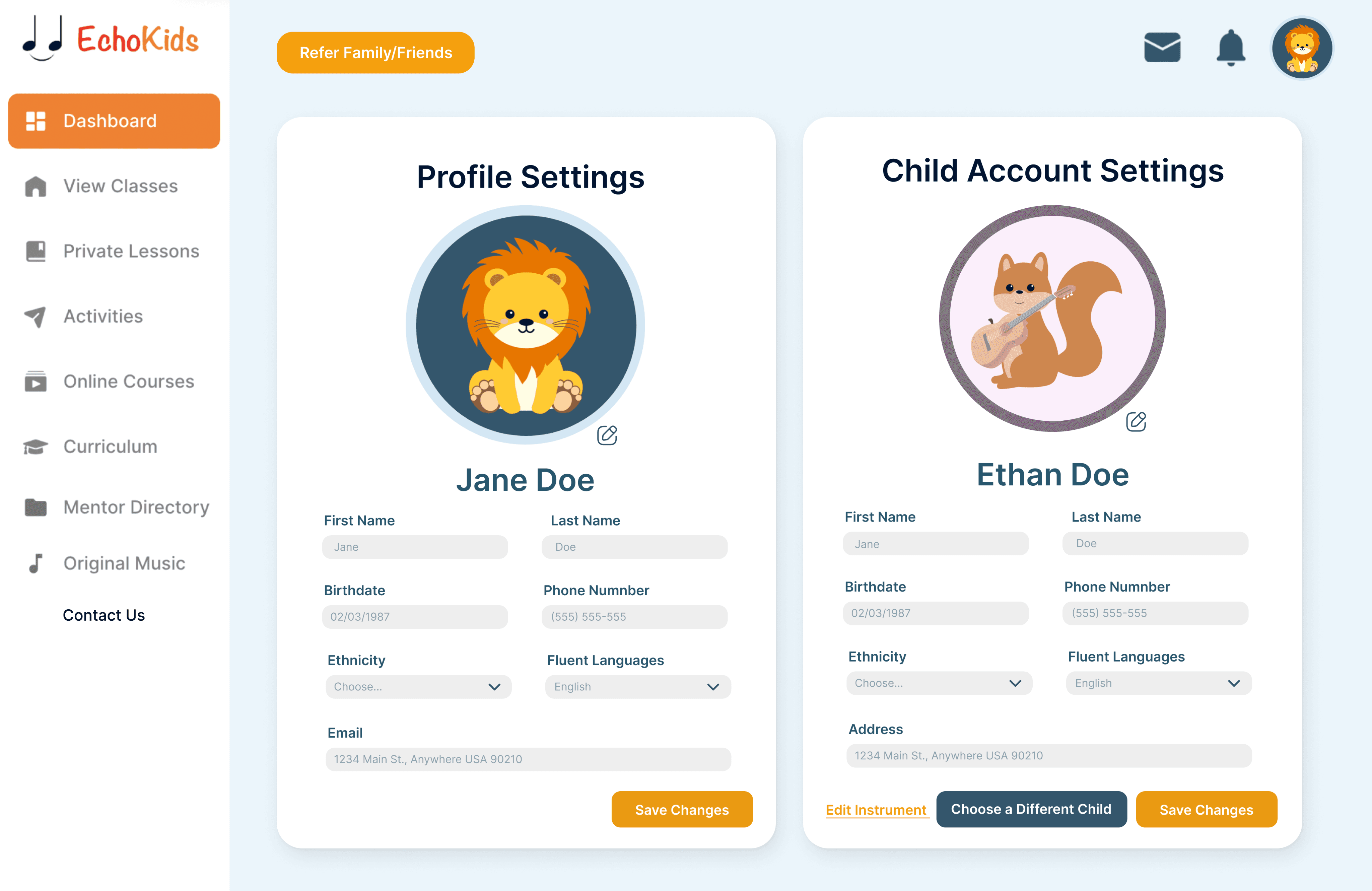
The initial parent settings page was plagued with bugs and outdated design.
After
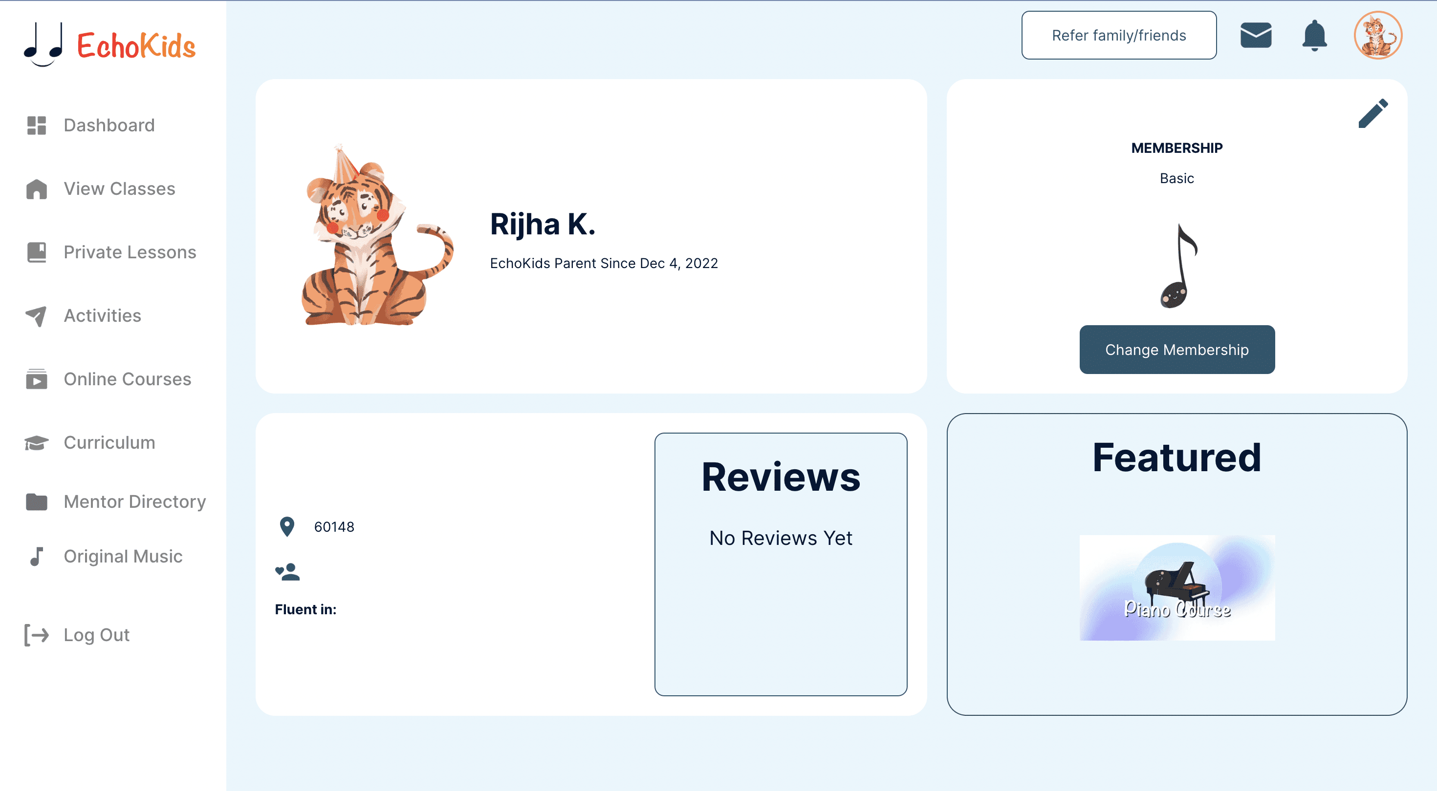
The settings were made user-friendly and provided the ability for parents to change the settings for their children as well.

Final Redesign: Before and After
EchoKids Web Application - New Pages
Users unable to link children or switch profiles
No existing student dashboard
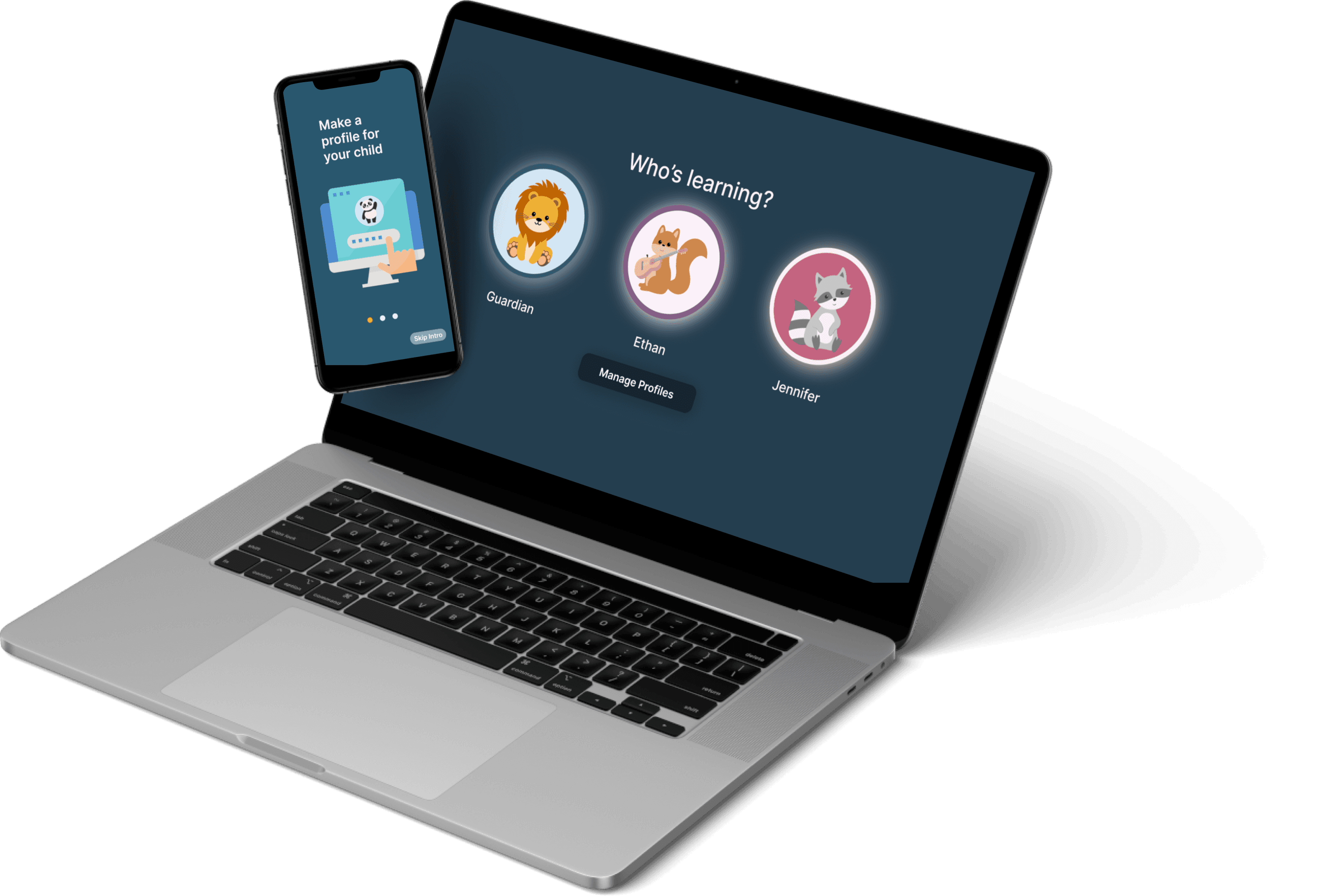
Based on the identified pain points, a landing page for multiple profiles was created to allow linking of children to parent accounts. This not only resolved the issue of users being unable to link children and switch profiles but also facilitated the implementation of a student and parent dashboard, each with distinct features and capabilities.
The “manage” profile option was added to the landing page, allowing guardian users to:
Edit profiles
Link children to different parent accounts to be mindful of a variety of different family types
Look at their children’s instrument wishlists
The student dashboard was created to be inclusive of the younger, student audience and motivate them by incorporating elements of gamification which include:
Music-related games
Achievable levels and coins
Avatars that can be unlocked with coins through an online “shop”

Results: Data-Driven Decisions
Google Analytics
As mentioned earlier, my role redesigning the web application began in November and spanned 3 months until the end of January. At the start of the project, the website presented the following metrics and were converted to the latter after the duration of the internship:
The significant improvement in January 2023 compared to November of the same year is a positive indicator of the success of the redesign project. The bounce rate dropped from 1.59% to 0.68%, indicating that users are spending more time on the platform and engaging with the content. Additionally, the average session duration increased from 03:27 minutes to 04:01 minutes, which shows that users are finding the platform more user-friendly and are exploring it more deeply. The number of new users also increased slightly from 222 to 230, demonstrating that the redesign has also helped in attracting more users to the platform. These metrics suggest that the redesign has had a positive impact on the user experience and that the changes have helped in retaining and attracting users to the platform.
November 2022 - January 2023 Statistics
1.59%
Bounce Rate
222
New Users
03:27 minutes
Average Session Duration
0.68%
Bounce Rate
230
New Users
04:02 minutes
Average Session Duration
Mobile Design: Considerations
EchoKids Mobile Application - The Beginning
In creating the mobile experience, there were several key considerations I had to keep in mind:
Overall, the goal was to create a seamless and intuitive mobile experience that reflected the changes and improvements made to the web application, while still maintaining the platform's unique character and identity.
I had to take into account the technical constraints and limitations of mobile devices, ensuring that the platform would function smoothly and effectively on a range of devices and operating systems.
it important to preserve the brand identity of the platform while still creating an immersive and user-friendly experience on mobile devices. This required careful attention to design and user experience elements, as well as a deep understanding of the needs and expectations of the platform's users.
Brand Identity
Mobile Design Constraints
Final Redesign: Mobile
Onboarding Screens: Brand Identity
Main Dashboard Screen
Messages Page
Onboarding Screens: Instructions
Notifications PAge
Settings Page
EchoKids Mobile Application - Full Prototypes
Incorporating brand identity in the mobile application was done by utilizing the company’s 3 C’s motto. It is important because it helps to:
Establish a clear and consistent representation
Helps to differentiate the product from others in the market, making it stand out and helping users to recognize it easily
Sets a positive first impression and can increase user engagement and retention
Including simple instructions in the onboarding sequence was important because:
It helps familiarize new users with the application and ensured that they fully understood how to use the platform
It can prevent confusion and promote familiarization with the new application
By taking the time to walk new users through the key features and functions of the app, it sets them up for success and encouraged them to continue using the platform.
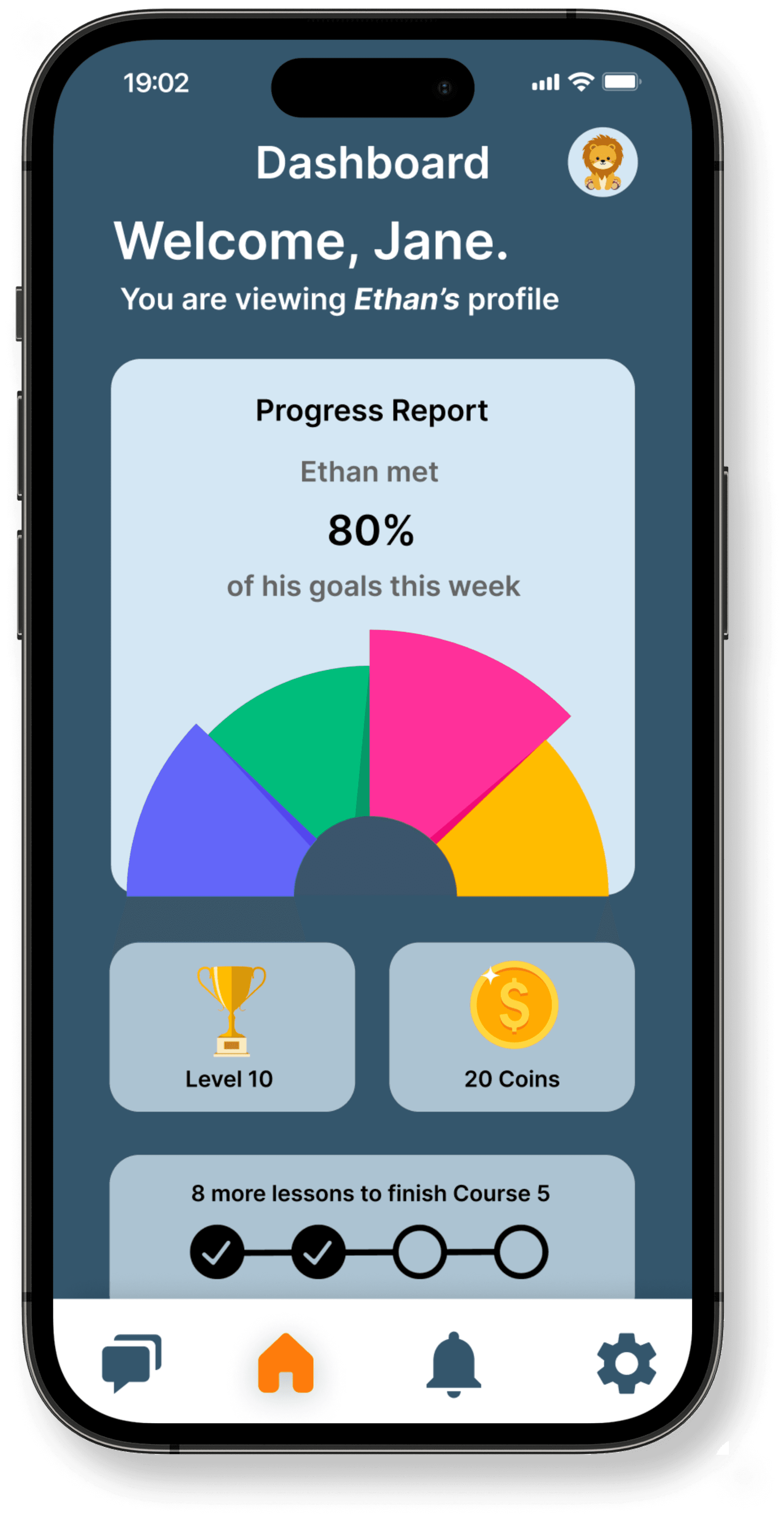
The main dashboard was designed to be a comprehensive resource for both parents and students, featuring:
Progress Reports
Levels
Coins
Gamification
This was important to ensure that both parents and students have a clear understanding of the student's learning progress and achievements.
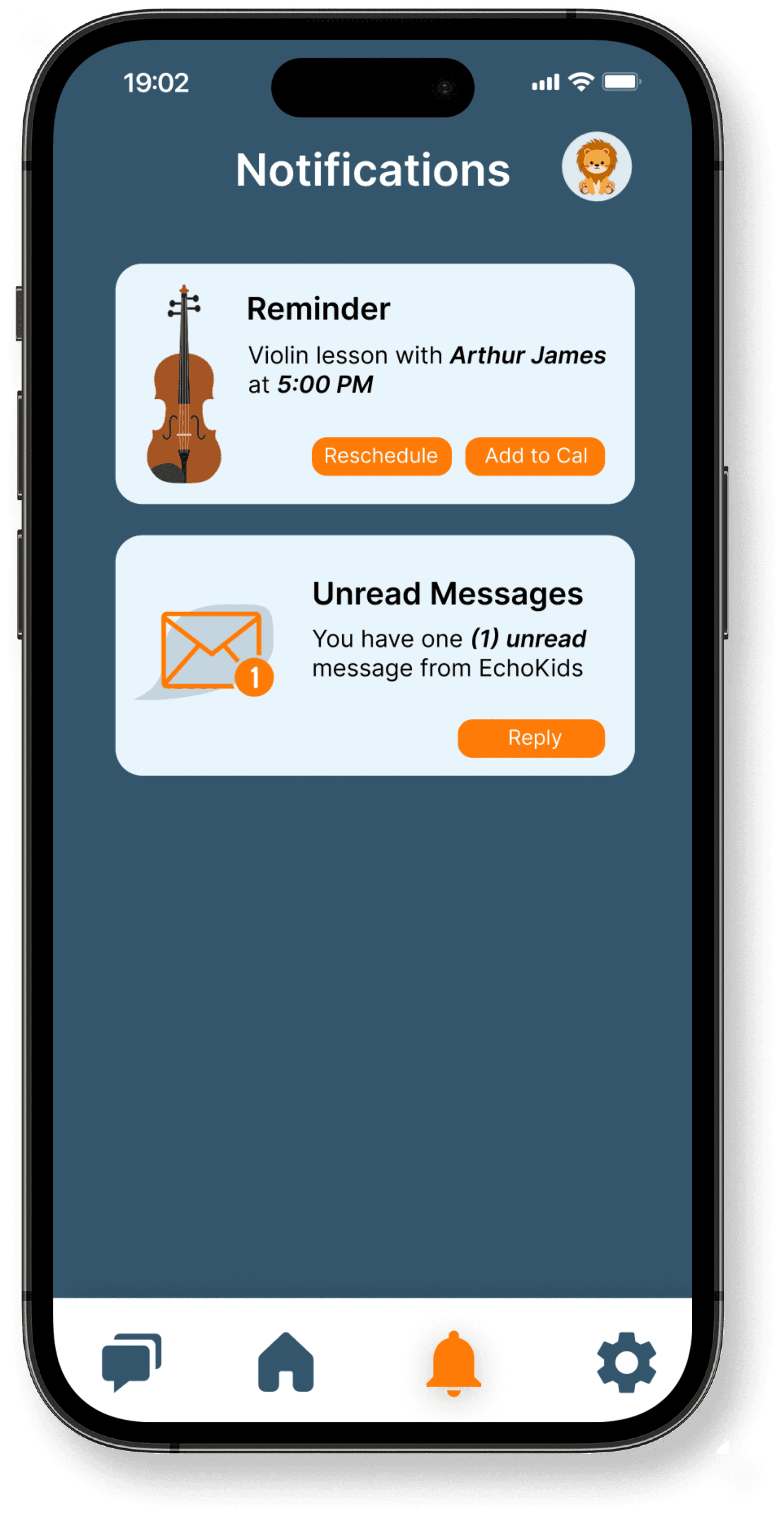
The notification page was designed to include actionable buttons within each notification bubble, allowing for quick and efficient ways to act upon the notification including:
Conveniently reschedule or add upcoming lessons
Swiftly respond to unread messages
Dismiss unwanted notifications
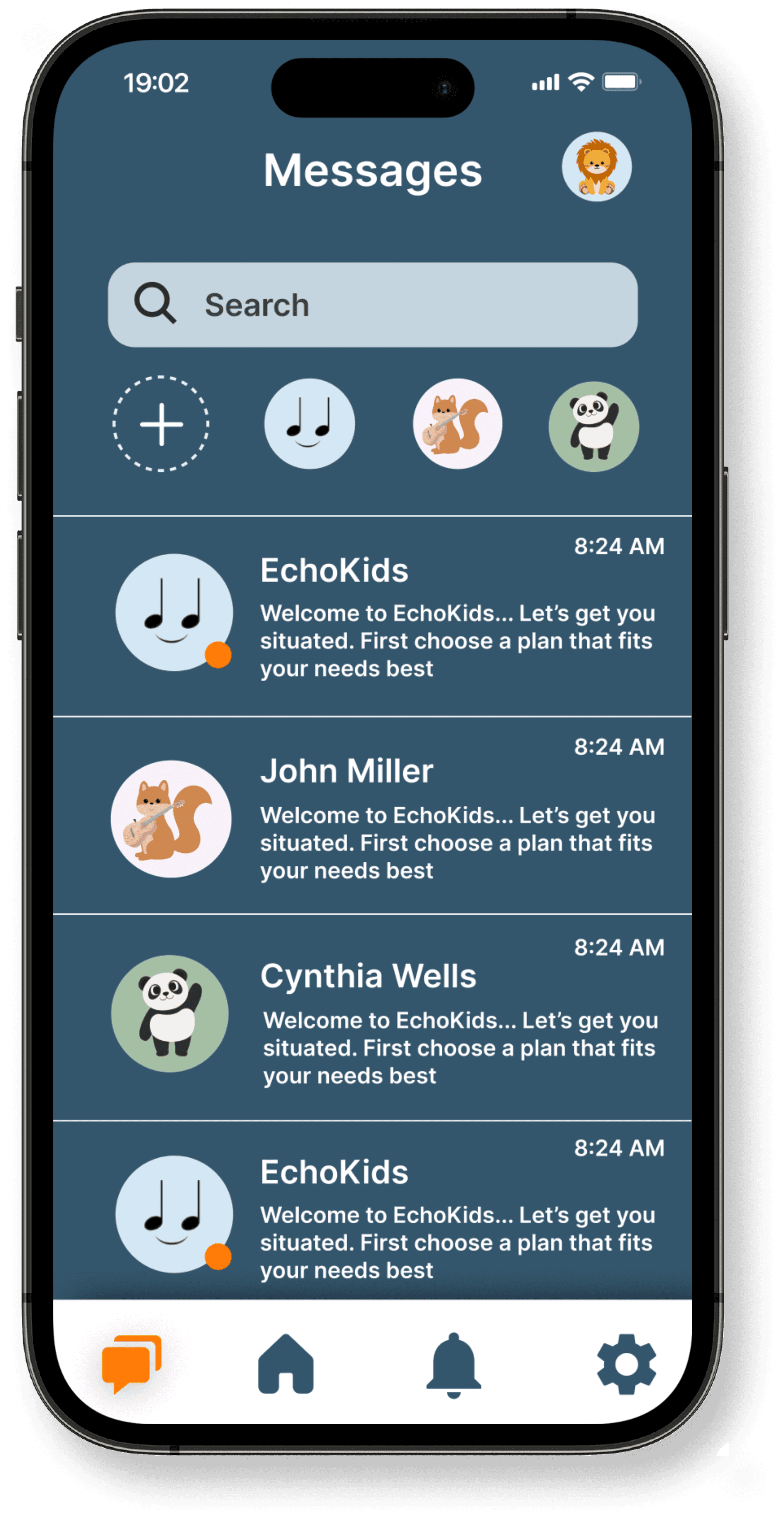
The messages page allows for easy navigation and organization of all communications within the platform. Features include:
Messaging to both mentors and EchoKids support
A search function to allow quick access to specific messages
A list of most contacted people to quickly start a new message to them
Previews of all messages
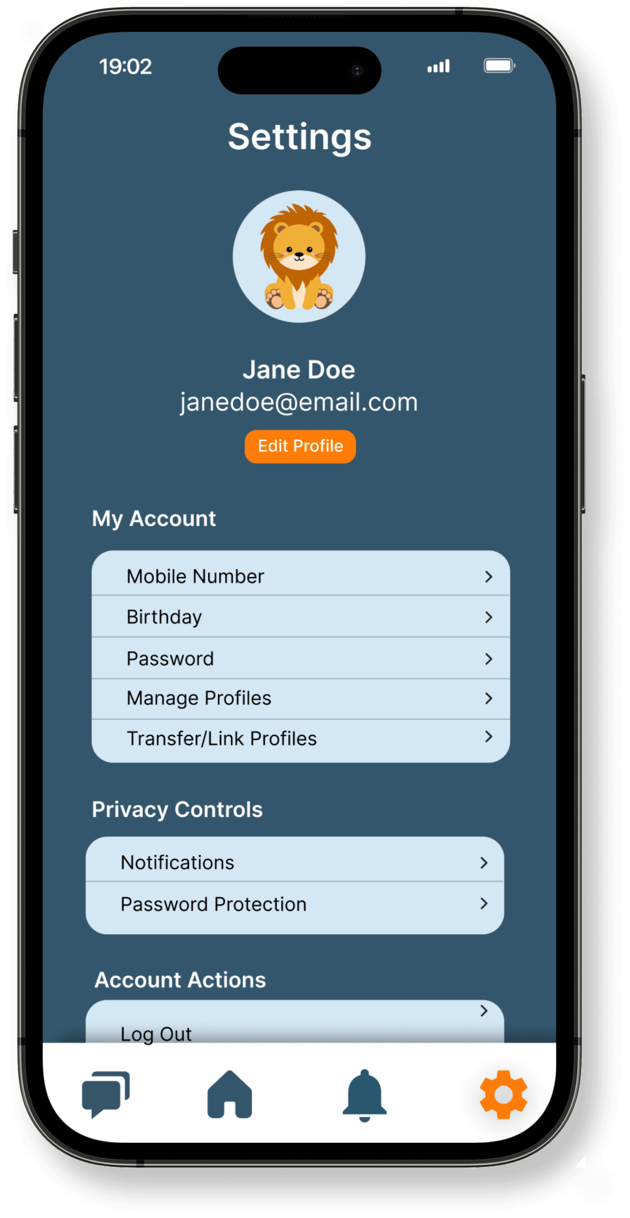
The settings page is a centralized location for users to manage their account and control their privacy preferences. It is grouped in three categories:
General Account Settings
Privacy Controls
Account Actions
In this page, users have the ability to transfer and link profiles, as previously available in the web application as well.


Key Takeaways

What I Learned
Communication with cross-functional teams: having a shared understanding of goals and regular updates can help ensure that everyone is working towards a common objective. I also discovered the benefits of utilizing different skill sets and perspectives to generate creative solutions and make well-informed decisions.
Preserving brand identity: I learned the significance of preserving the brand identity while creating an immersive user experience. Keeping the brand image consistent across the onboarding process, design, and layout emphasized the importance of maintaining the integrity of the brand and creating a recognizable user experience. Incorporating the brand identity not only created a visually appealing application but also helped establish a strong connection with the users.
Importance of key metrics: I gained valuable experience in the importance of data analysis and tracking key metrics to evaluate the success of the mobile application. This included monitoring bounce rate and average session time, which gave me a better understanding of the user experience and allowed me to identify areas for improvement. This experience has given me a stronger appreciation and motivation in regard to the impact that data can have on design and development decisions.